Abstract Nature : Personal Project 1

Abstract Nature : What is Abstraction?
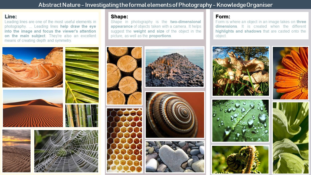
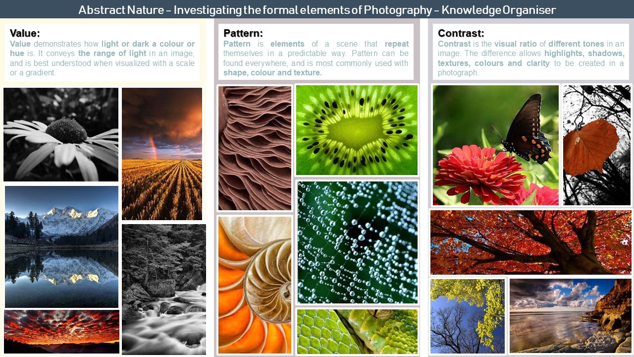
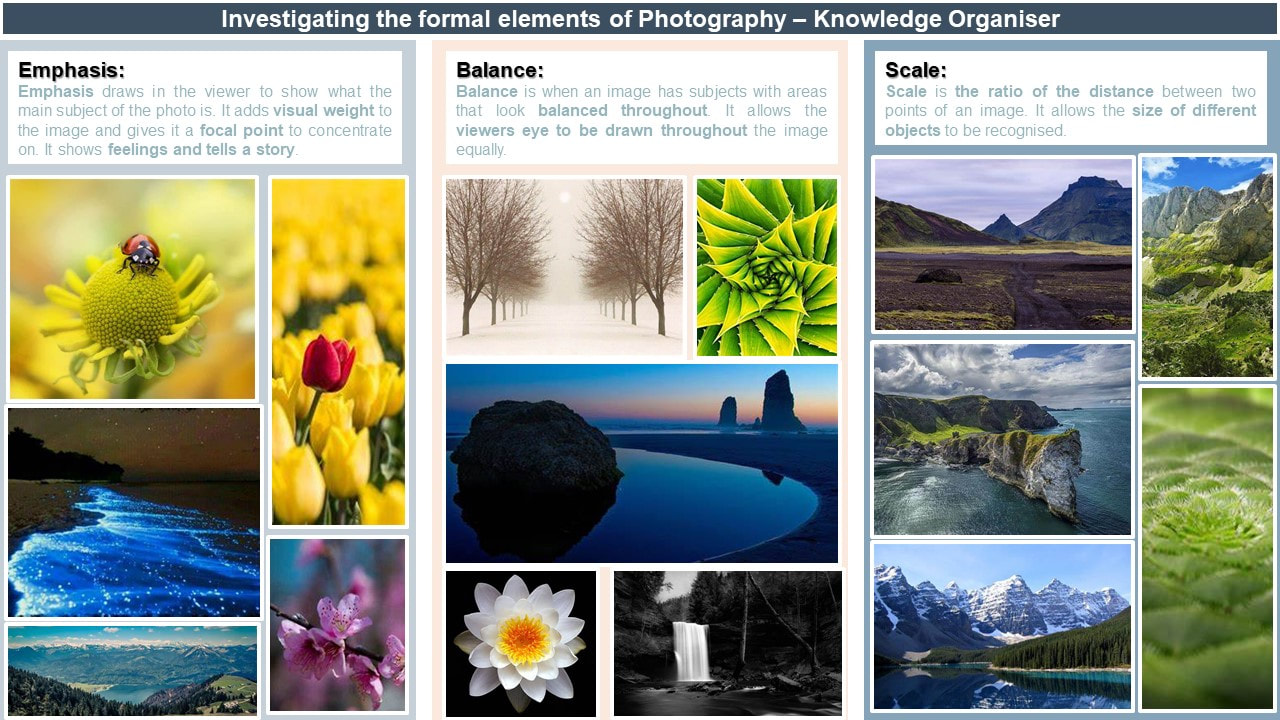
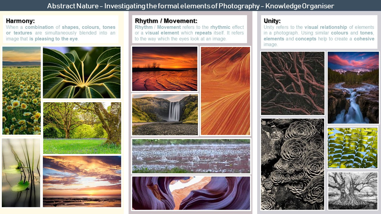
Abstract photography, also known as non-objective, experimental or conceptual photography, is a way of depicting an image that does not have an immediate association with the object that has been used, that has been created through the use of photographic equipment, processes or materials. Primarily, abstract photography focuses on the Elements of Art (line, shape, colour, tone, texture, form, space) and the Principles of Design (pattern, contrast, balance, scale, rhythm / movement, unity) . These are known as the Formal Elements of Photography. Below are some examples of Abstract Photography that I am inspired by and some initial research into the Formal Elements of Photography.


Abstract Nature : Investigation of abstract photography techniques
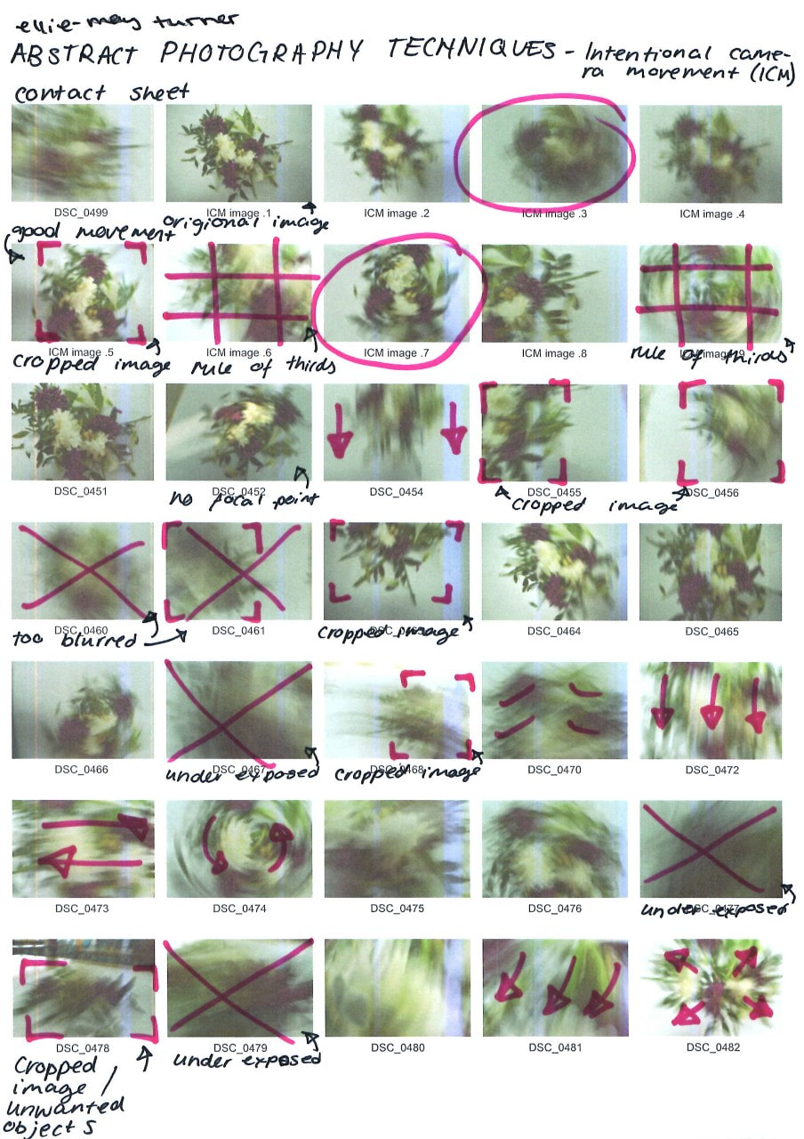
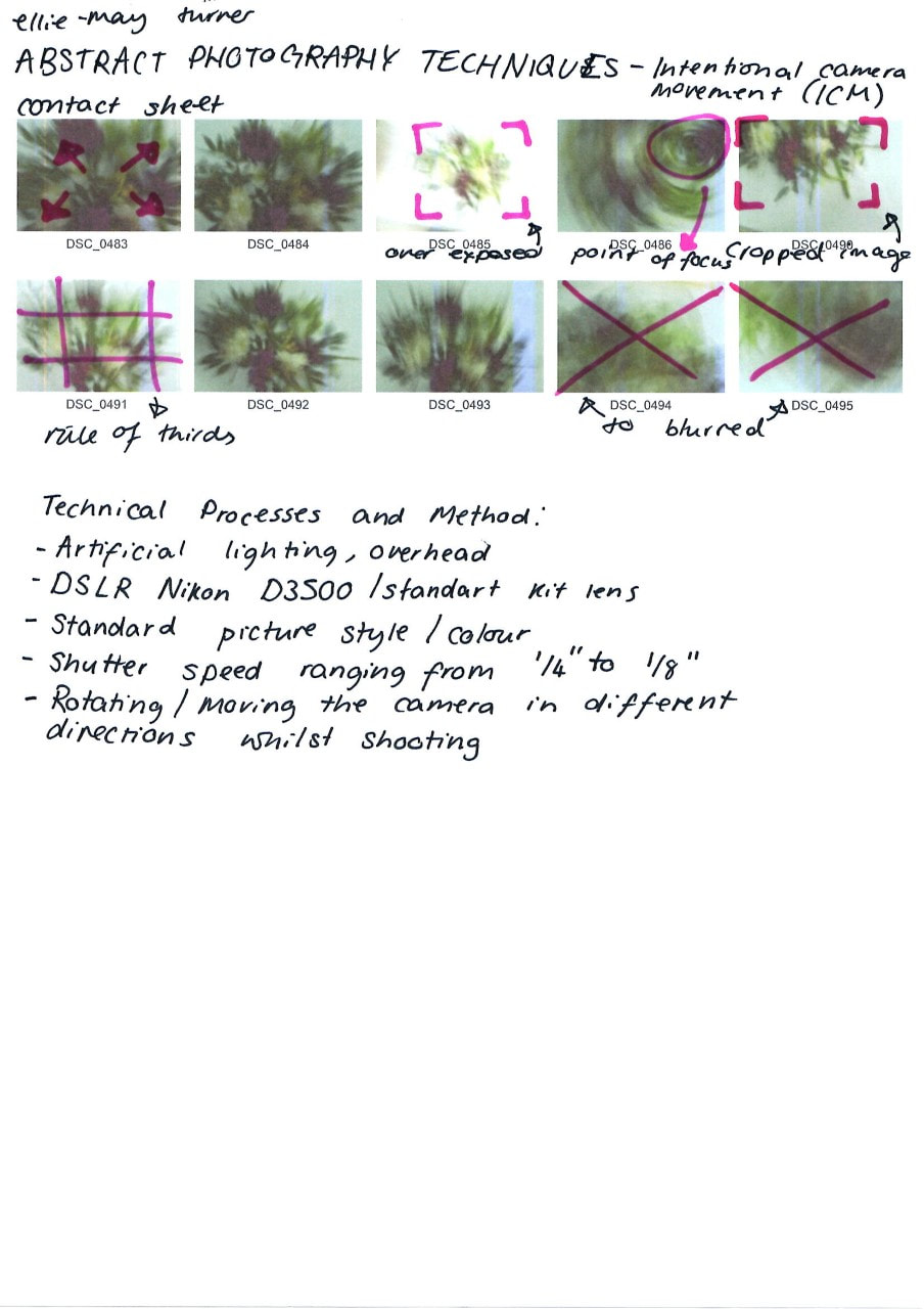
ICM Shoot
|
|


|
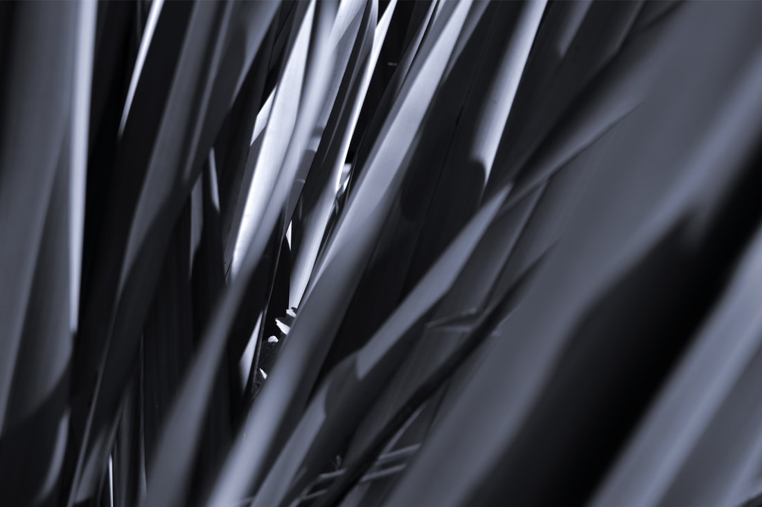
ICM (intentional camera movement) is the intentional movement of the camera to create an abstract image. The longer the shutter speed of the camera, the more movement is created in your image. This effect can be created by moving either the subject or the camera. By doing this, it gives the image a look of a warped reality, almost looking like it’s in a dream. The longer shutter speed creates a blurred and distorted effect, making the subject less identifiable.
During my shoot I used a DSLR camera (Nikon D3500 with a standard kit lens) on the standard colour mode. For my shutter speed I experimented with different times, mainly using times between 1/4" and 1/8". I found that these times were the best as it allowed me to get a full range of motion without making the subject completely unidentifiable. The different types of movements I used were : rotating the camera 90 degrees, moving the camera closer and further away for the subject, moving the camera up and down, and moving the camera in a gentle circular motion. From these movements I created a range of effects, from making the image slightly fuzzy to making the image look like a whirlpool. For this shoot I used both natural lighting (the sun coming from the windows) and artificial lighting (from the ceiling lights). I enjoyed using both of these lighting methods, however the natural lighting wasn’t very reliable as the weather isn’t very predictable. Another challenge I faced with the lighting was the shadows. Because the ceiling lights were aerial, I created shadows from being underneath them, which later showed up in some of my images as the exposure kept changing. This created a lot of different tones and values, and gave different moods to each of the images, however I feel that the shoot went well overall. I think that one of my strengths of this shoot was the large range of different motions I used, and next time I would pay more attention to the lighting and use it to my advantage. I liked this shoot as you can create different feelings and atmospheres from deliberately moving the camera, and distort the actual reality of the objects in the photographs. Shallow Depth of Field Shoot |


|
|
|


|
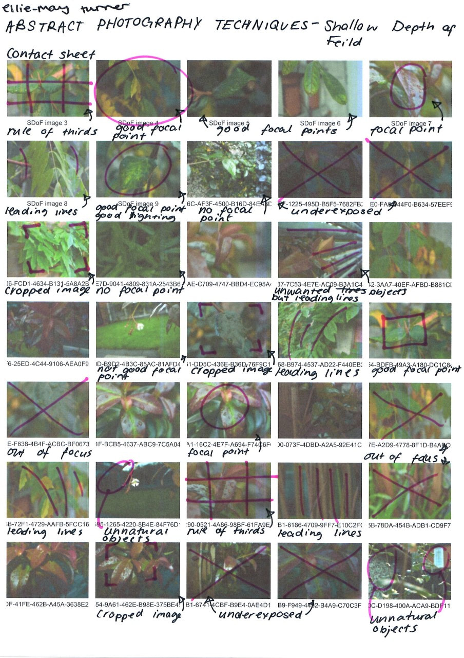
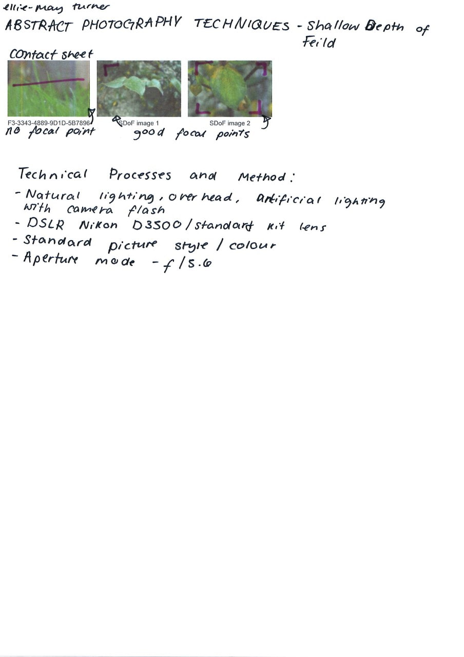
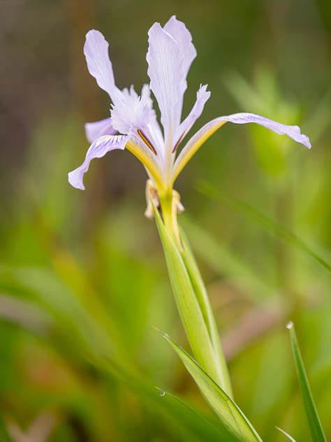
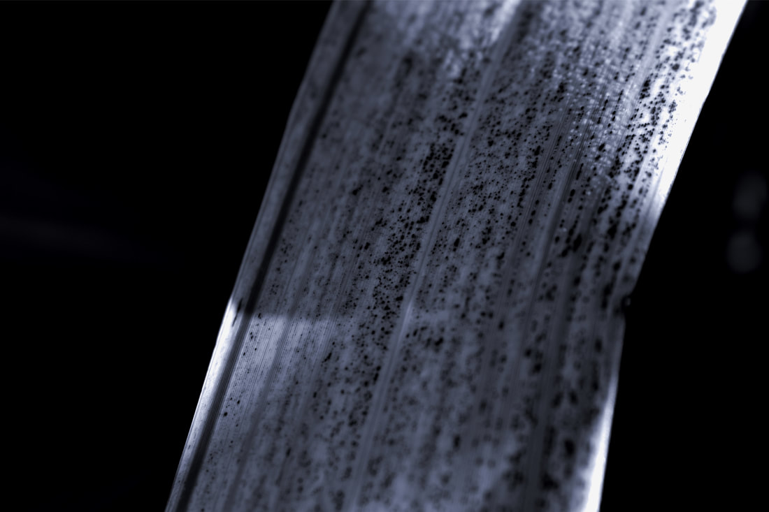
A shallow depth of field can be used to create a main focal point in an image. By creating a blurred background, it draws the viewers attention to the subject in focus, and allows their eyes to be guided around the photograph, starting with the most important part - the part you want to be seen first. This technique is helpful in abstract photography as it obscures the background, holding information from the viewer that could be helpful and give the image context.
For this shoot I used a DSLR camera (Nikon D3500 with a standard kit lens) and I used multiple different settings on my camera. During my shoot I faced a few challenges, the first one being my camera settings. The shutter speed would become longer the higher the aperture priority was, which made my images blurry, so I had to experiment with different settings to reach the same effect. The second challenge I faced was that it was getting dark as it was getting later in the day, which meant some of my photographs underexposed. Finally, as it was winter, I was challenged with finding nature to photograph as all the flowers had died, however there was luckily some vines still alive that I was able to photograph. Overall, I think my shoot went well as I achieved a shallow depth of field in many of my photographs, and I captured a lot of different details in the plants I took photographs of. |

|
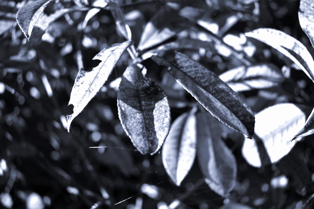
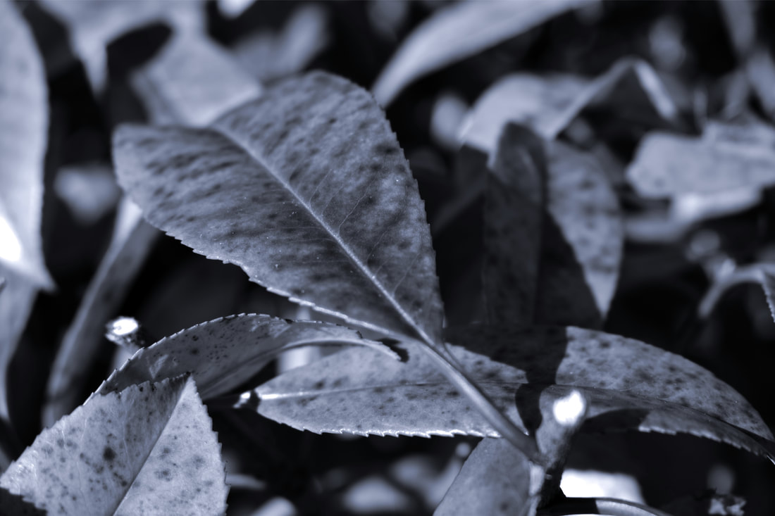
Monochromatic Photography Shoot


|
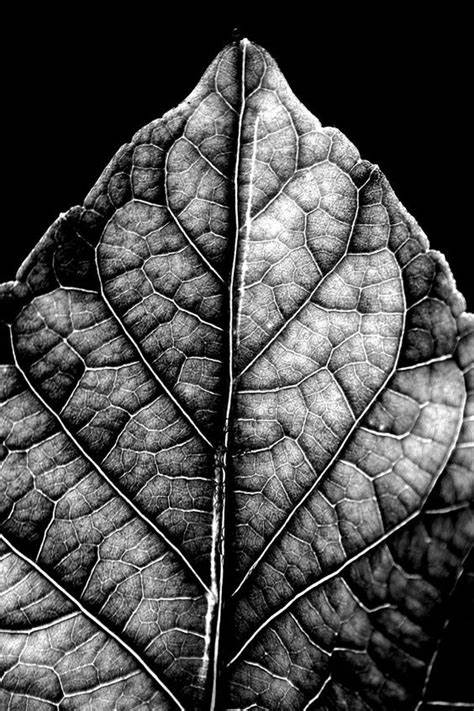
Shooting in black and white can have an amplifying effect ; since the colour is eliminated, it allows you to focus and pay more attention to the texture, value, tone and line of an image. This is helpful in abstract photography as it can often times make the subject in the photograph unrecognisable and entice the viewer to find out more behind the image.
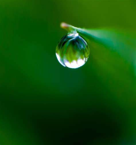
For this shoot I used a DSLR camera (Nikon D3500 with a standard kit lens) on the black and white / monochrome setting. I used the highest aperture priority, which was f/5.6, to show as much detail as possible. I took the photos at different angles : some pointing downwards to the floor, some pointing upwards to the sky, some at eye level and some at floor level. Almost all of my photos were of the different types of plants and foliage, however I also took a a few pictures of a spider and it’s web. I shot these images outside on a sunny day, so I had lots of natural lighting. For some of the photos, the shadows added a nice, contrasting effect between light and dark tones. However, for other images the shadows that were created by me and my peers led me to no not being able to capture the maximum amount of detail that I could have. As it had been raining earlier, I captured the condensation and water droplets on the leaves, and the textures it had created. |

|
Abstract Nature : Investigation of Techniques and Best Images
|
I feel this image is successful because of how the use of the seven elements of art, such as pattern and texture, combine and work together in the picture. A shallow depth of field allows there to be a clear focal point of the photograph, which in this case is the spider and the rule of thirds further enhances this focal point. Although the lighting does cast some nice shadows in the piece, it makes the subject harder to see, and less noticeable at first glance.
By using Pixl-r, I was able to change and edit some of the characteristics of this image. I increased the exposure as well as the highlights, and I decreased the shadows to create a higher contrast. I also changed the tint and hue to a cooler colour to give a wider range of tones. By using a f/3.5, I was able to create a shallow depth of field for a more interesting focal point. I think one of my strengths in this image was tone since there is a large range from light to dark, and the shadows created also contribute to the span of tones. I also think that the way the top left and bottom right part of the leaf is unfocused allows the photograph to have a bright focal point.I think that this image is one with the most successful edits because of the texture and pattern on the leaf, making it abstract. The flow of the lines on the image leads the viewers eyes around the photograph, making it look like the object is cascading, and the shallow depth of field creates a restful composition. Because of the spotty pattern on the leaf, the subject is disguised, and could possibly seen as something else, such as a magnified object or a banana peel.
Using Pixlr I post-edited this images expose, tint, hue, highlights, shadows and contrast. By increasing the contrast, highlights and shadows, I was able to create an almost completely black background, producing a focal point on the subject. Because of the black background, a restful composition is formed, making the subject abstract and unnoticeable as there is no background to give context to the rest of the photograph. I think a strength of this image is the solid colour background as it gives a lot of contrast to the photograph. I believe this image is successful because of the abstract pattern made from leading lines and tones, as well as the blurred foreground.
Whilst editing, I did not need to crop the image as it already abstract and was already distinguished by the leading lines in the image. I also di not want to remove any of the blurred foreground of the image as I think it adds in a great amount of abstraction and withhold of context. The overall range of tone in this photography constructs a mystical atmosphere as there are both bright highlights and dark shadows, giving it an undetermined feeling. Using Pixl-r I increased the exposure as well as the highlights, and darkened the shadows to give a deeper contrast. I also changed the tint and hue to a cooler colour to give the photo a colder and icier feeling. I feel that the main strength of this image is the abstraction. As I took a picture of a plant with many leaves, all of the foliage took up the frame, allowing for no further needed cropping. I believe this is a successful photograph because of the different types of textures and patterns within each leaf, producing a large range of tones and values. The shallow depth of field applies context to the image, and the rule of thirds further enhances the intricate and detailed focal point.
During the post-editing with Pixl-r, I increased the exposure and highlights to make the photo brighter, and I also increased the shadows to further amplify the contrast. I changed the hue and tint to a cooler tone to keep with the running theme of my edits. I feel that the main strength of this edited photo is the rule of thirds, as there is something interesting going on in each section of the image. it also leads the viewers eyes around the photograph, slowly allowing the audience to gain more information of the image. |


Artist Investigation / Edward Weston
“My own eyes are no more than scouts on a preliminary search, for the camera’s eye may entirely change my idea.” – Edward Weston
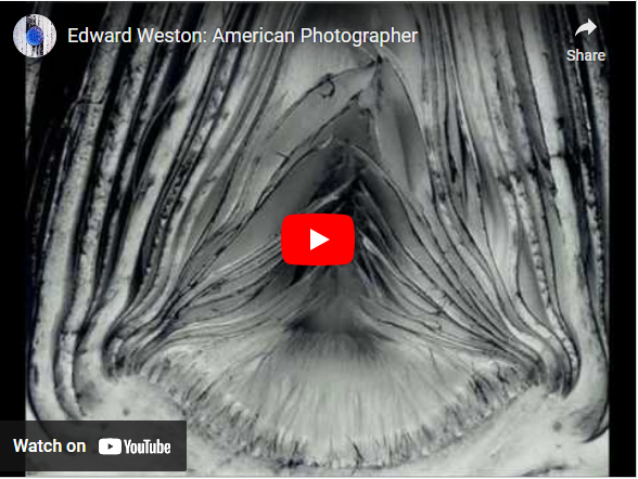
Why this video?
This video is inspirational to me as it shows many of Edward Weston's incredible photographs. I find that the display of different images is inspiring as Edward Weston explored and experimented with many interesting and unutilised types of subjects when he was alive, as well as also introducing the topic to new photographers. It is intriguing that his work is still being studied today, almost 65 years later. |
Why this artist?
To begin my Abstract Nature Artist Investigations, I will initially study the work of Edward Weston. He explores the genre that we are studying, which is abstract nature. Edward Weston's work contains many of the seven elements of art and principles of design, making his work look sharp, intriguing and carefully composed. Who was he? Edward Weston was born on the 24th of March in 1886 in Illinois America, and died on the 1st of January 1958 in California America. He is best known for his monochromatic photographs on abstract objects, and has been referred to as 'one of the most innovative and influential American photographers'. He was also known for using a view camera, before the digital camera was invented, and he processed his film negatives using a dark room. Why the quote? I chose this inspirational quote because it typifies the idea that what we see with our own eyes can be conveyed entirely differently with a camera. Because of this, it can lead to abstract images, that can be completely unidentifiable without any context. |
Below are a selection of 10 Weston images that I find inspiring because there has been a range of different subjects used to create abstract photographs.


SEMI Analysis / Edward Weston

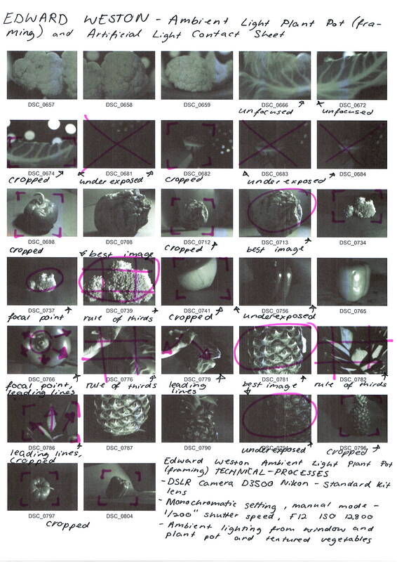
To emulate this photograph, I would use a shutter speed of 1/200”, f 12 and an ISO of 12800 all on manual mode with a monochromatic setting. Additionally, I would also need to create a black background using black paper, or I could also use a plant pot.
|
The photographer of this image is called Edward Weston.
The title of this photograph is Pepper No. 30, dating back to 1930, and the genre of this photograph is still life. The subject of this image depicts a deformed, green pepper photographed in a monochromatic setting. The composition of this photo displays a disfigured pepper positioned in the centre of the frame. The rule of thirds shows that there is an area of interest in each of the nine segments of the image, and the viewer's eye is lead around the curves of the pepper because the perspective is at eye level. The photographer employs a range of visual elements in his work. The most striking elements are line, tone and shape. The lines in the image help lead the eyes around the different shapes of the pepper. The tones also gives context, showing that the pepper is a three-dimensional object. The photo has been taken from a short distance so that only the pepper is in view, and there is very little background to focus on. This is so that the pepper becomes the main focal point of the image. The pepper has been placed in the foreground of the picture to lead the viewer's eyes around the object and eventually to the background. The photo was taken through a large, tin funnel placed on its side, with overhead lighting in Edward Weston's studio. Because of the position of the lighting, there is a large shadow casted in the background of the image, and the shadow becomes lighter in the foreground. This creates a large contrast within the photograph, as the tones range from dark shadows to light highlights. This produces a serene atmosphere because of the grey tones and contrast. |


Technical Processes / Low Key Photography

|
Low Key can be a challenging genre of photography , even for the most skilled photographers.
Low Key is the technique of lowering the exposure on a camera to let in a small amount of light when taking your image. This helps to create a sharp contrast that features both dark and dramatic colours. Because of this, it leaves an impact on the viewer as the image is full of a variety of tones and contains different aspects of detail. |
Shoot Plan / Edward Weston

|
This shoot was inspired by Edward Weston because of his use of uncommon vegetables and distinctive monochromatic and low key imagery.
The shoot will take place in the school photography room with natural light coming from the large windows (and possibly artificial lighting from ceiling or light boxes if the weather is being temperamental), and a plant pot and/or black cardboard will be used for the background to present the vegetable. This is because Edward Weston used a funnel as a background to take one if his most famous pictures, Pepper No. 30. This will also create a dramatic composition as it puts a focus on the main subjects, which will be different types of vegetables. I will also be taking these photographs during the middle of the day to utilise the amount of natural light that is produced. |
I will be experimenting with producing low key photographs as that is Edward Weston's style of work that I am currently studying, however if I need to create more light in a shaded area, I will use a white sheet of paper to reflect the light and create a brighter image.
I am going to shoot with my DSLR Nikon D3500 with a standard kit lens in the monochromatic setting to best emulate Edward Weston's work. It will have a low ISO setting for a darker image as I want as little light as possible to generate a low key photograph. As well as this, it will also have an aperture of f/12 for a moderate shallow depth of field. To avoid blurry / shaky images, I will use a stack of books to stabilise my camera, and I will also use a fast shutter speed of about 1/160 " to 1/200” to reduce the amount of light let in to contribute to the low key-ness of the image. This will also further help to stabilise the image since the photograph will be taken at such a high speed, essentially freezing time.
I am going to shoot with my DSLR Nikon D3500 with a standard kit lens in the monochromatic setting to best emulate Edward Weston's work. It will have a low ISO setting for a darker image as I want as little light as possible to generate a low key photograph. As well as this, it will also have an aperture of f/12 for a moderate shallow depth of field. To avoid blurry / shaky images, I will use a stack of books to stabilise my camera, and I will also use a fast shutter speed of about 1/160 " to 1/200” to reduce the amount of light let in to contribute to the low key-ness of the image. This will also further help to stabilise the image since the photograph will be taken at such a high speed, essentially freezing time.
Edward Weston Contact Sheet
|
|
Editing Process Low Key Photography / Edward Weston


Best Edit / Edward Weston
|
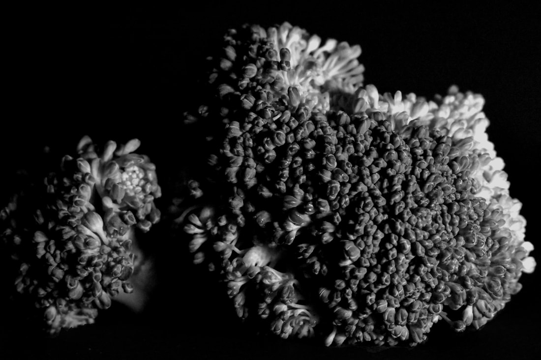
I feel that one of the main strengths of this image is the dark background that was created. I was able to make it completely black when it had before been different tones and contained different, unwanted textures.
When prost-processing, I used Pixl-r and slightly lowered the exposure. I also increased the contrast to emphasise the tones, highlights and shadows of the broccoli in the image. The use of artificial lighting allowed me to choose where the lighting point would be and how the shadow would be casted. I feel this was a large benefit to the final outcome as the detail of the broccoli is easy see whilst simultaneously being impressionistic. I think a strength of this photograph is the range of tones from both the highlights and shadows. I believe another success of this photo is the high amount of detail that can be seen throughout the image, especially when the rule of thirds is used.
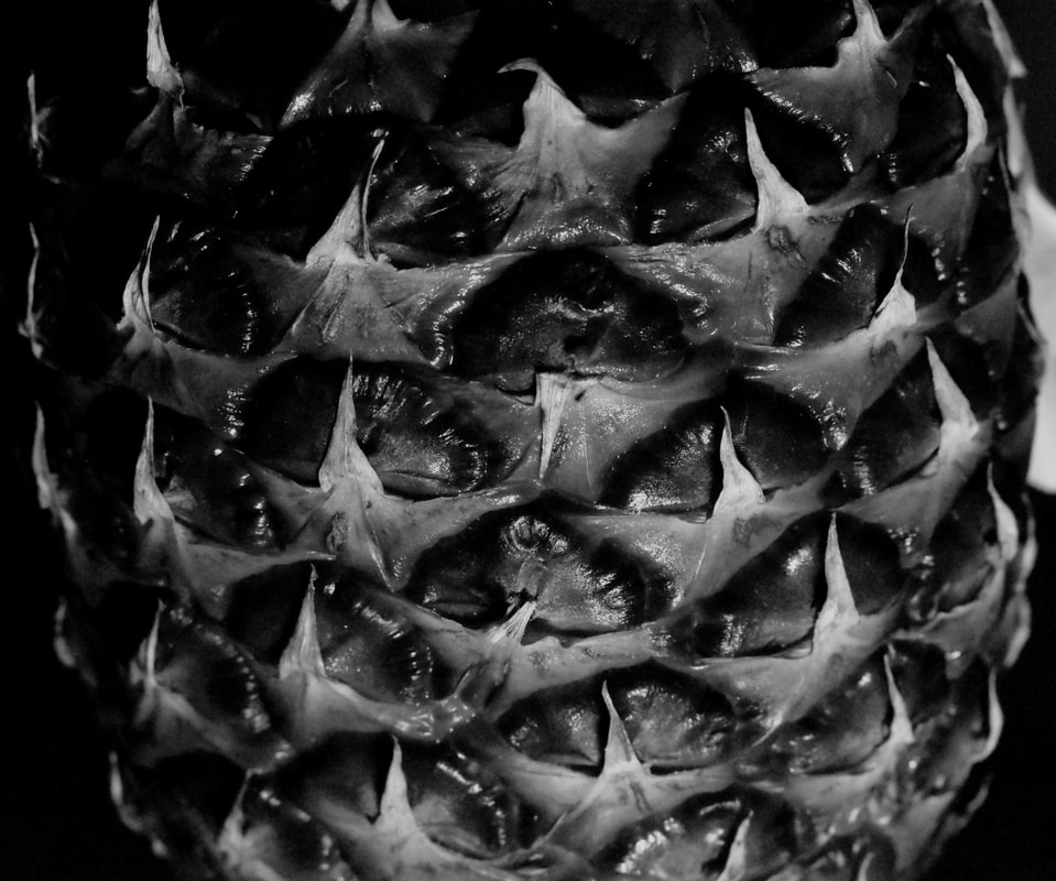
Using Pixl-r to edit, I lowered the exposure and and increased the contrast and highlights, as well as increasing the sharpness to allow for more detail. The use of overhead lighting introduced little shadow to the actual fruit, and a dark shadow to the base of the pineapple, producing a completely solid background for the object to be showcased on. Next time to improve, I would crop the image further to eliminate all the background as I feel that it does slightly take away from the main aim of the photograph. |
|
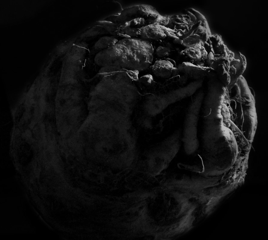
A strength I find in this image is the positioning of the celeriac and the eye level angle of which the picture has been taken at, since it makes the object nice to view and lessens the context that surrounds what it actually is.
When post-processing, I used Pixl-r to adjust the background as before you could see the impurities of the backdrop. To do this, I selected the areas I wanted to darken with the lasso tool. I then completely decreased the exposure, whilst keeping it feathered to create a nice blend that would not be harsh. I repeated this a few times until I got the desired darkness of the background. I feel that this could have gone better as there are some blurry areas near the top, side and bottom of the celeriac that doesn’t properly blend out to the backdrop. With the use of low key photography I was able to achieve a very under exposed image, similar to Edward Weston’s photos, however next time I would either change the lighting technique during the shoot, or increase the exposure during post-editing, since I feel that this image is too dark in retrospect to Weston. |
|
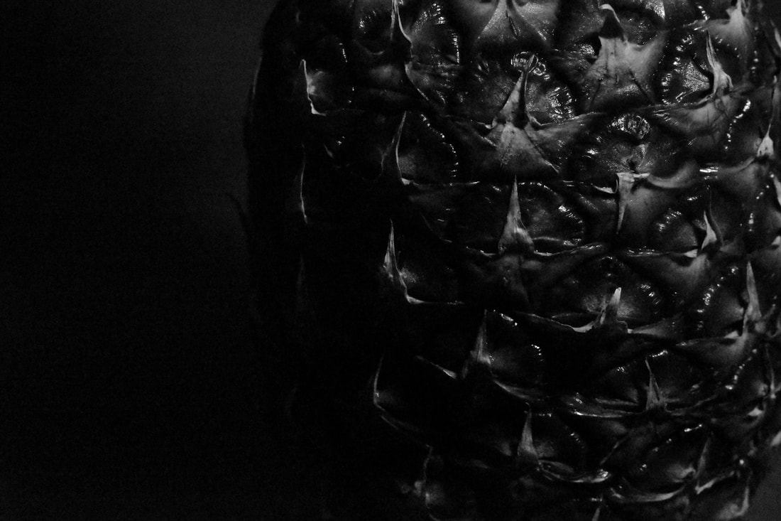
I feel this photograph was the most successful one out of all my edits. This is because it includes a full range of tones, clear detail and a good composition. It also sticks to the theme of abstraction with a mysterious atmosphere created by the background intruding into the foreground.
During the post-editing process, using Pixl-r I lowered the exposure and contrast to merge the subject with the backdrop. I also used the lasso tool to select the areas near the bottom that needed further darkening. In contrast to my other edits, I didn’t increase the sharpness of the image as I felt that the noise in it contributed to a vintage-style, similar to Weston as his photographs were taken in the 1800-1900s. Although it is not noticeable at first glance, I believe it really adds to the final outcome of this photograph. The use of a shallow depth of field and a focal point on the pineapple provided further help to produce an abstract photograph. |
Abstraction through Cyanotypes / Anna Atkins
How do modern photographers use this method today?
Cyanotypes are still being used today, however not in the same way Anna Atkins did. Today they are mainly used to create modern, contemporary artwork through one of the earliest forms of photography. A recent example of cyanotypes being produced in this way it the Winter Blues : Contemporary Cyanotypes collection, displayed at the Centre for Photographic Arts in Carmel, presenting many incredible photographs, predominantly based on natural forms. Below are some images from this collection. |
Who was Anna Atkins?
Anna Atkins (1799-1871) was an English photographer and botanist. She was the first person to create a book containing photographic images inspired by natural forms, and some sources even say she was the first woman to create a photograph. Not only did she create amazing images, today valued as art, it contributed to scientific research. What are cyanotypes? Cyanotypes are one of the earliest types of photographic printing, and was first discovered in 1842. It is a slow-reacting, economical photographic printing formula sensitive to light which produces distinctive dark blue / greenish blue prints. It is made from potassium ferricyanide and ferric ammonium citrate, often printed on water colour paper to withstand being washed in water. What are the advantages and disadvantages of cyanotypes? When printing cyanotypes, it's a relatively cheap and simple process with a wide range of medias that can be used, with no need for a dark room or complicated equipment. Although there are many advantages of cyanotype printing, there are still a few disadvantages to this form of photography. If the print is exposed to concentrated sunlight for a long period of time, it can cause the print to become over exposed, and leave your cyanotype a washed out blue colour. Printing the cyanotypes can also be quite a lengthy waiting time; it is not unusual to be waiting thirty minutes for your cyanotypes to develop under a typical UV light. |


My Cyanotypes

|
Over the past few lessons, I have been experimenting how to create different types of photographs through cyanotypes.
The first type of cyanotype I created was on water colour paper. After I painted the papers with light-sensitive salts and let them dry (using both a normal technique for painting as well as different mark making), I placed natural forms on the watercolour papers, such as dried leaves and flowers. I then encased them between a board and a piece of plastic, and allowed them to develop underneath a UV light. Finally, I rinsed them under water to stop any further development and allowed them to dry. This was repeated for the rest of the watercolour paper as well as the fabric sample, however for the broccoli cyanotype a negative, of one of my past images had been used with acetate instead of natural forms. I think that the most successful cyanotypes are the fabric sample and the mark making sample. The main reason I feel that these have had the best outcome is the clean lines of the natural forms as the other cyanotypes had become blurry during the development process. I also think that they are successful as they have come out with a deep blue colour, unlike the negative cyanotype, where I had washed it with water for too long. Although I think that the mark making and fabric sample cyanotypes could have been executed better (e.g. the stained fabric and the bleeding of the light-sensitive salts) I believe that they have the best outcomes out of all my examples. If I were to do this lesson again in the future, I would next time find a better way to secure the movement of the natural forms since they had become blurry during development from moving around. I would also like to try scaling the cyanotypes up, as well as experimenting with other medias to produce the cyanotypes on. |
Abstraction through Photograms / Man Ray
|
Who was Man Ray?
Man Ray (1880-1976) was an American photographer who was most commonly known for his pioneering photography. He was a visual artist who spent the majority of his career in Paris, as well as producing major works in a variety of medias, however considered himself a painter above all. What are photograms? Photograms are pictures that have been produced with the lack of a camera, and instead photographic materials, such as light-sensitive paper. They are developed by placing objects onto the light-sensitive paper and exposing it to light, ultimately producing shadowlike photographic images without the use of a negative or a camera. What are the advantages and disadvantages of photograms? An advantages to photograms is that they don't require any expensive cameras; all you need is light-sensitive paper (which can be found in an art objects to create a composition and a source of light, such as the sun. On the other hand, a disadvantage to producing photograms is that the technique displays the tones oppositely to the ones seen in reality, which might not have the desired look that someone wants. |


Horst P. Horst / The unfamiliar and abstracted


Technical Processes / High Key
|
High key photography is a genre of photography which eliminates all the shadows in an image, as well as having a pure white background to display as much detail as possible.
It's produced by having a bright light to over-expose your image, whilst also keeping as much detail as possible. Oppositely to low key photography, high key photography produces a happy and cheerful atmosphere in an image. High key images have an overall bright colour palette (as well as a bright aura) and little contrast from the lack of shadows. The recommended camera settings from the video are ; a remote flash of 1/8 power, 1/50" shutter speed, a F/16 aperture and an ISO of 100. |


Shoot Plan / Karl Blossfeldt

This shoot was inspired by Karl Blossfeldt as we have been studying his creative processes of photographing natural forms in an abstract way.
I plan for the photoshoot to take place in doors as I know this would be the most controlled environment. The shoot would be midday since that is when there is the most natural lighting. The props I intend to use are natural forms such as flowers, seed heads, fruits and vegetables since these are common in Blossfeldt's work. I will also use a plain white backdrop called perspex, which allows some light to pass through. |

|
I will us high-key photography with the help of soft box lighting to eliminate any unwanted shadows as this would be most similar to Blossfeldt’s style of photography. I will also use remote flashes as well as natural ambient lighting to draw attention to my main subject.
I will us high-key photography with the help of soft box lighting to eliminate any unwanted shadows as this would be most similar to Blossfeldt’s style of photography. I will also use remote flashes as well as natural ambient lighting to draw attention to my main subject.
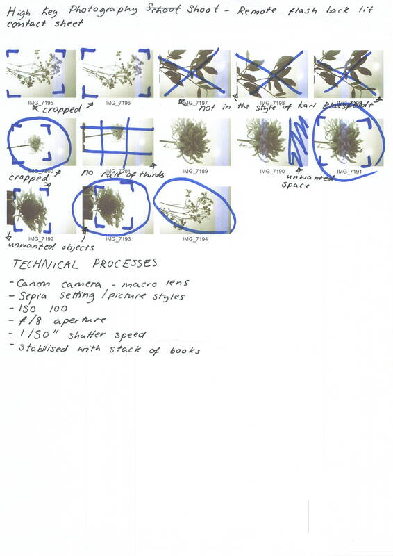
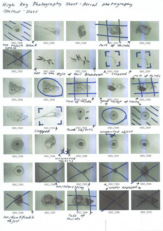
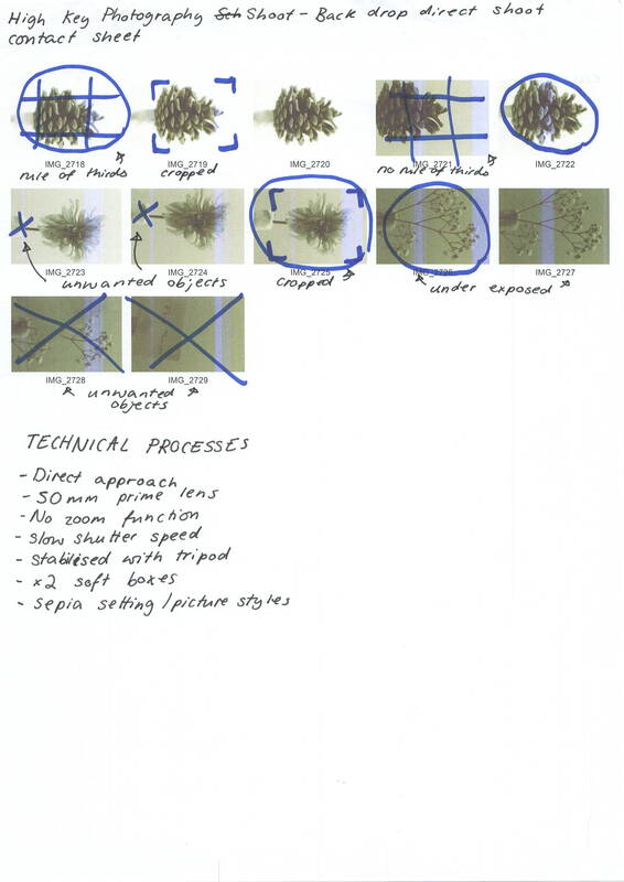
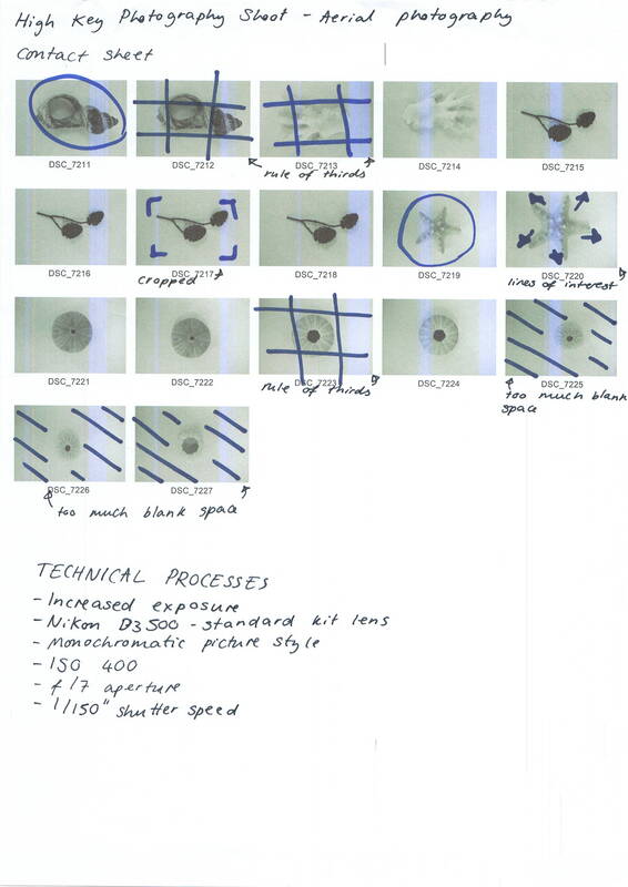
I will use both the school Canon DSLR 4000d camera with a macro lens and my Nikon D3500 camera with the standard kit lens. The picture style will be taken in sepia to produce a vintage look, however if this can not be achieved it can be created through post shoot editing.
During my shoots I will use a slow shutter speed to allow more light through the lens for a high key photo. As I do not want any movement in my pictures I will use books and a tripod to stabilise my camera.
I will us high-key photography with the help of soft box lighting to eliminate any unwanted shadows as this would be most similar to Blossfeldt’s style of photography. I will also use remote flashes as well as natural ambient lighting to draw attention to my main subject.
I will use both the school Canon DSLR 4000d camera with a macro lens and my Nikon D3500 camera with the standard kit lens. The picture style will be taken in sepia to produce a vintage look, however if this can not be achieved it can be created through post shoot editing.
During my shoots I will use a slow shutter speed to allow more light through the lens for a high key photo. As I do not want any movement in my pictures I will use books and a tripod to stabilise my camera.
Artist Investigation / Karl Blossfeldt
My botanical documents should contribute to restoring the link with nature. They should reawaken a sense of nature, point to its teeming richness of form, and prompt the viewer to observe for himself the surrounding plant world.
Why this video?
This video is inspirational to me because it goes into detail about who Blossfeldt was and how his work is significant. It describes some of Blossfeldt’s techniques and ways of capturing miniscule plants to display them in new formats. |
Why this artist?
To begin my Abstract Nature Artist investigation, I will initially study the work of Karl Blossfeldt because he takes photographs of natural forms with the technique of high key photography. Who is he? Karl Blossfeldt was born on the 13th of June in 1865 and died on the 9th of December 1932. He was most famously known for his close up photographs of plants and living things, published in 1929 as Unformen der Kunst. Why this quote? I chose this quote as I feel that the message being conveyed is that nature should be studied in more depth, with the helpful use of photography. I also think i means that the modern world needs to be linked with botany to show the incredible features we don't often see at sight. |


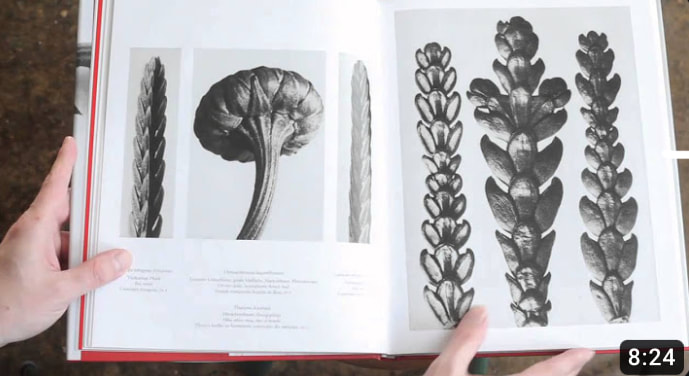
SEMI Analysis / Karl Blossfeldt

Acanthus mollis (Soft Acanthus, Bear’s, Breeches. Bracteoles with the Flowers Removed, Enlarged Four times)
1898-1928 
COLOUR PALETTE

|
The photographer of this photograph is called Karl Blossfeldt.
The title of this photograph is Acanthus mollis, a botanical form, and the genre of this image is high key and still life. The props I can see in this photo are the main subject (the acanthus mollis) as well has a plain background. Karl Blossfeldt uses the seven visual elements of art in his work to create this photograph. In my opinion, one of the strongest elements I can see is tone. Throughout the image, I can see a large range of values being displayed; the dark tips of the plant, the light body of the leaves and the middle values form the stem and the background. This adds depth to the plant, making it seem more realistic through the image as there are more characteristics being shown. This, paired with the use of photo enlargement makes it seem that these plants are unreal, part of a different world, but they can be found in your garden, the same place where Blossfeldt got most of his photographic subjects. Another element I can see being demonstrated in this photograph is texture, as there is a high amount of detail in the image. The veins in the plant make the photo look almost three dimensional, as if you can reach out and touch it. The pointed edges of the leaves also convey the high amount of texture shown throughout Blossfeldt's work, demonstrating the different amount of forms that can be found in a single plant. The main focal point of the image is the protruding leaves of the Acanthus mollis. I can tell this because the subject has been place of the centre of the frame, as well as it being eye level. Using the rule of thirds further supports this as there is an area of interest in each section. I think Blossfeldt decided with this composition to draw attention the complex characteristics of the plant. I believe this photograph has been taken in a studio with controlled lighting to eliminate as much of the casted shadows as possible. I can see that the lighting in this image has been diffused as it is not strong and there aren't any harsh shadows. I feel this photo gives a message of darkness and allurement. I think this way because I feel that the veins look like delicate and intricate spider webs, or even a human nervous system. These details flowing through the body of the plant makes it look mysterious and eerie, and pairing it with the vintage looking photo and dark colour palette only adds to those creepy factors. Not only this, but the spike-y tip of the leaves resembles spindle-y human fingers, increasing the amount of uncanny characteristics this plant has, emulating that of a humans. When I take my own photographs I will try to emulate this moody atmosphere by choosing subjects with a similar colour palette, yet keep the bright and high key lighting to capture the unnatural feeling of a lack of shadows. |


Karl Blossfeldt Contact Sheets
|
|
Editing Process / Karl Blossfeldt
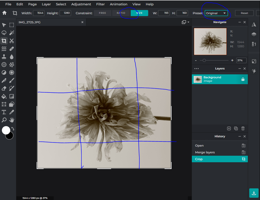
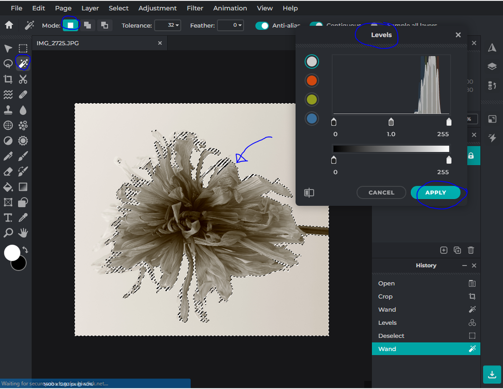
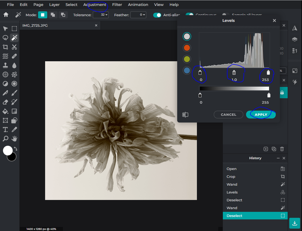
To edit my images I used the online editing software PIXL-R. When editing my imaged, I focused on cropping, adjusting the levels of the background as well as the overall image. Here are some pictures from the editing process:
1. Cropping the image
2. Using the magic wand tool to select and edit the background
3. Adjusting the levels of the image for the correct range of tones and contrast
9 Best Images / Karl Blossfeldt


I feel that the strengths of these overlays are that they have a dramatic atmosphere whilst keeping the element of looking like a vintage photograph. Not only this, but I also feel that there is a large range of deep, contrasting tones which further influences the dark ambience. To improve my images, next time I would vary my overlays as well as varying the different images used.
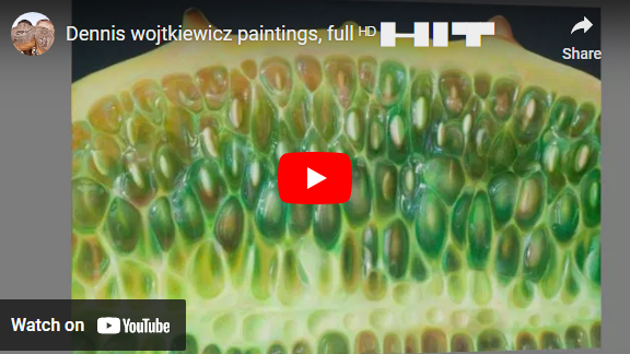
Artist Investigation / Dennis Wojtkiewicz
|
Email Quote – Direct Artist Response |
|
Why this artist?
The final artist in the Abstract Nature project is Dennis Wojtkiewicz. This artist differs from my other artists because he uses photography as a reference for his paintings because he is an artist. He also differs from my other artists because he incorporates a large range of colours in his work since he is a contemporary artist, whereas Edward Weston and Karl Blossfeldt shot their pictures in monochromatic or sepia tones as they did not yet have the technology to shoot in colour. However, there are similarities in all of the artists imagery - their use of high key photography, which is used to demonstrate the high amount of detail in each subject. He also uses natural forms, such as flowers and fruits - similarly to both Edward Weston and Karl Blossfeldt. Who is he/she? Dennis Wojtkiewicz was born in 1956 and is most famously known for his hyper-realistic paintings of natural forms. His website is: www.wojtkiewiczart.com |
Why the quote?
The quote is from a direct email response from Dennis Wojtkiewicz himself. From the email, I was able understand what equipment & techniques he uses such as a Canon EOS 90D camera with a Canon EF 100mm f/2.8 Macro USM fixed lens, as well as using back lighting to increase the amount of detail in his pieces.
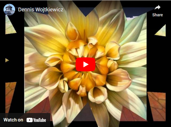
Why this video?
This video is inspirational to me because it displays detailed, photorealistic fruits, as well as exemplifying the striking complimentary colours which haven't been seen through the past artists I have studied. Each artwork illustrates a restful composition, holding balance and harmony throughout the image.
The quote is from a direct email response from Dennis Wojtkiewicz himself. From the email, I was able understand what equipment & techniques he uses such as a Canon EOS 90D camera with a Canon EF 100mm f/2.8 Macro USM fixed lens, as well as using back lighting to increase the amount of detail in his pieces.
Why this video?
This video is inspirational to me because it displays detailed, photorealistic fruits, as well as exemplifying the striking complimentary colours which haven't been seen through the past artists I have studied. Each artwork illustrates a restful composition, holding balance and harmony throughout the image.


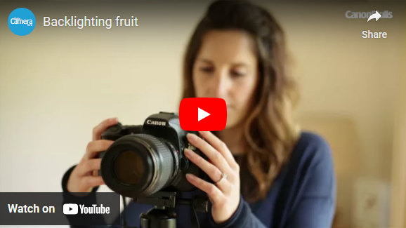
Photographic Techniques / Back Lighting Fruit
|
What is back lighting?
Back lighting in photography is a common technique used to produce more contrast in a photograph by positioning the main light source behind the primary subject in the image. It is often used to create an unique atmosphere within the image. What are the benefits of back lighting? Back lighting in photography emphasises the details in the chosen subject. It also highlights the depth of the image, giving the subject a greater sense of place as well as creating a dramatic contrast between the subject and the background. |
What equipment will you need?
To create a back light photograph, your will first need to choose a subject. This will need to be translucent and thinly sliced to allow some light to pass through, although if the fruit is slice too thinly, then too much light will be let through, which will blur and overexpose your image. A box light will be needed as the main light source, however if you do not have one, then you can produce one by placing a lightbulb underneath a sheet of glass (which could be from a picture frame). Use a tripod to stabilise your camera as the camera settings will have a low shutter speed, and a macro lens can be used to achieve maximum detail (although it is not required). Finally, use a shutter release cable to ensure there will be no movement in the final photographs.
To create a back light photograph, your will first need to choose a subject. This will need to be translucent and thinly sliced to allow some light to pass through, although if the fruit is slice too thinly, then too much light will be let through, which will blur and overexpose your image. A box light will be needed as the main light source, however if you do not have one, then you can produce one by placing a lightbulb underneath a sheet of glass (which could be from a picture frame). Use a tripod to stabilise your camera as the camera settings will have a low shutter speed, and a macro lens can be used to achieve maximum detail (although it is not required). Finally, use a shutter release cable to ensure there will be no movement in the final photographs.


|
Step 1 :
Thinly slice a translucent fruit. |
Step 2 :
Set up your light box as well as your fruit and camera. |
Step 3 :
Change your camera settings to best suit high key photography. |
Step 3 :
Use a shutter release cable to take your images for an outcome with no blur. |
Shoot Plan / Dennis Wojtkiewicz

|
This shoot plan is inspired by the paintings of Dennis Wojkiewicz, who uses backlighting in photography to produce his references for painting. The main element I can see in his work is colour. He uses a wide range of saturated tones to emulate the deep colours the fruits have in reality.
This shoot will be conducted indoors to give me greater control of the lighting. Although there will be ambient lighting coming from the windows, the main source of light will come from a light box placed underneath the main subject, hence the name 'backlit photography'. The light will be placed underneath a sheet of transparent glass, placed between two chairs, to allow light to pass through the glass and allow detail to be shown. The fruits will also have to be sliced thinly enough for the light to pass through them, however if they are sliced too thinly then the images will turn out overexposed. The fruits I will use will be oranges, grapefruits, lemons, limes, cucumbers and kiwis, I will also need a knife and a chopping board to slice my fruits. |
For this shoot I will use a Canon DSLR camera as well as a macro lens to ensure maximum detail throughout my work. To eliminate any type of camera shake or distortion, the camera will be set up on a tripod and I will also use a shutter release cable as that will completely eliminate any camera movement. The camera will be set to have an aperture of f/8 - f/12, and a will have a low ISO. The shutter speed will be open for a longer time to allow more light and detail to the camera.
Dennis Wojtkiewicz Contact Sheets

Post Editing / Dennis Wojtkiewicz
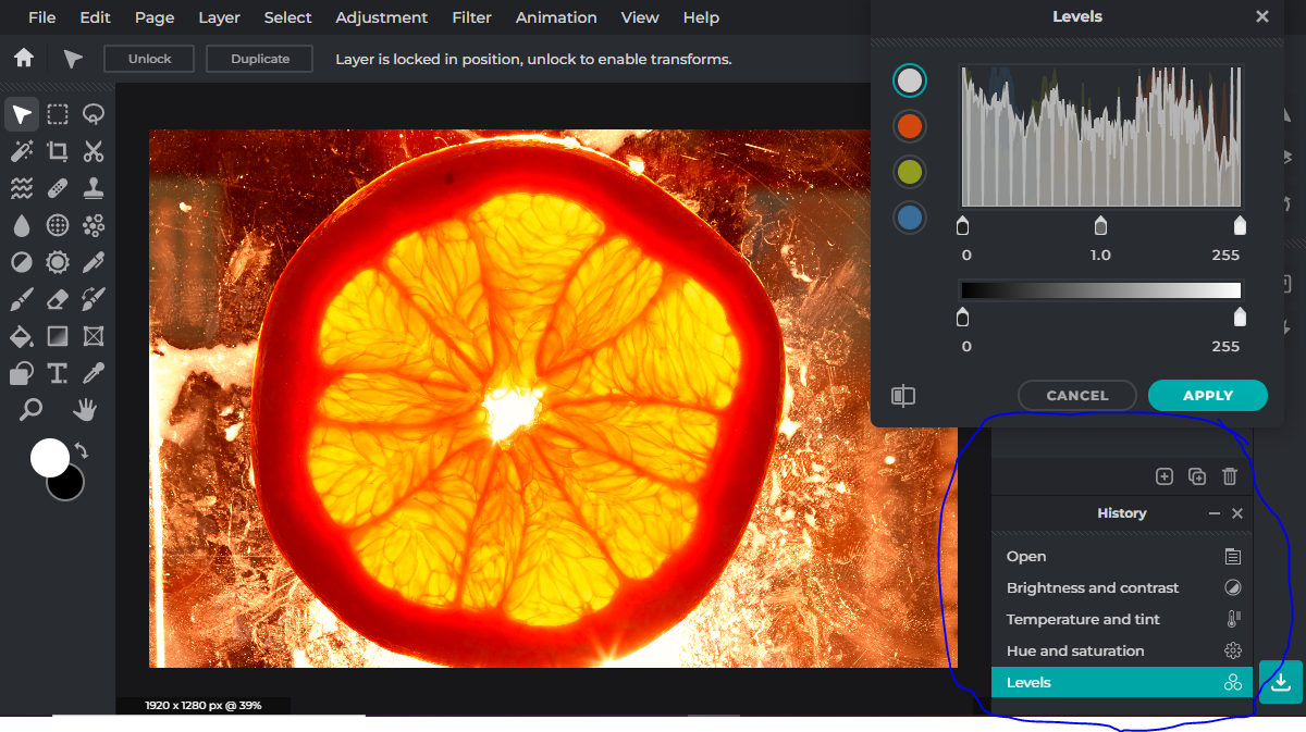
Editing step 1 : In this clip, I used the adjustment tools to enhance the colour, saturation and contrast in the image to further deepen the details that can be seen throughout the image. This helped amend the under saturation within the image.
|

Editing step 2 : In this clip, I used the lasso tool to select the fruit, adding and removing any parts of the image I didn't want in my image. I then inverted the selected fruit so I could remove the background, and fill it with white.
|
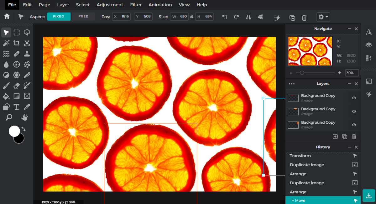
Editing step 3 : In this clip, duplicated the fruit multiple times and randomly arranged them in the image. Whilst doing this, I made sure to vary the sizes of my fruit as well as the positions.
|
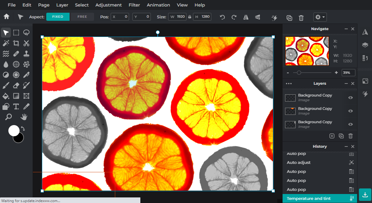
Editing step 4 : In this clip, I selected a few duplicates of the fruit and edited them to be monochromatic. I repeated this, however instead of changing the fruits to be monochromatic, I instead changed them to have a higher saturation and exosure,
|
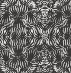
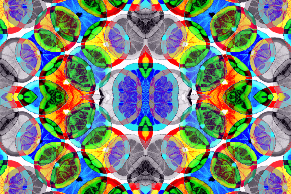
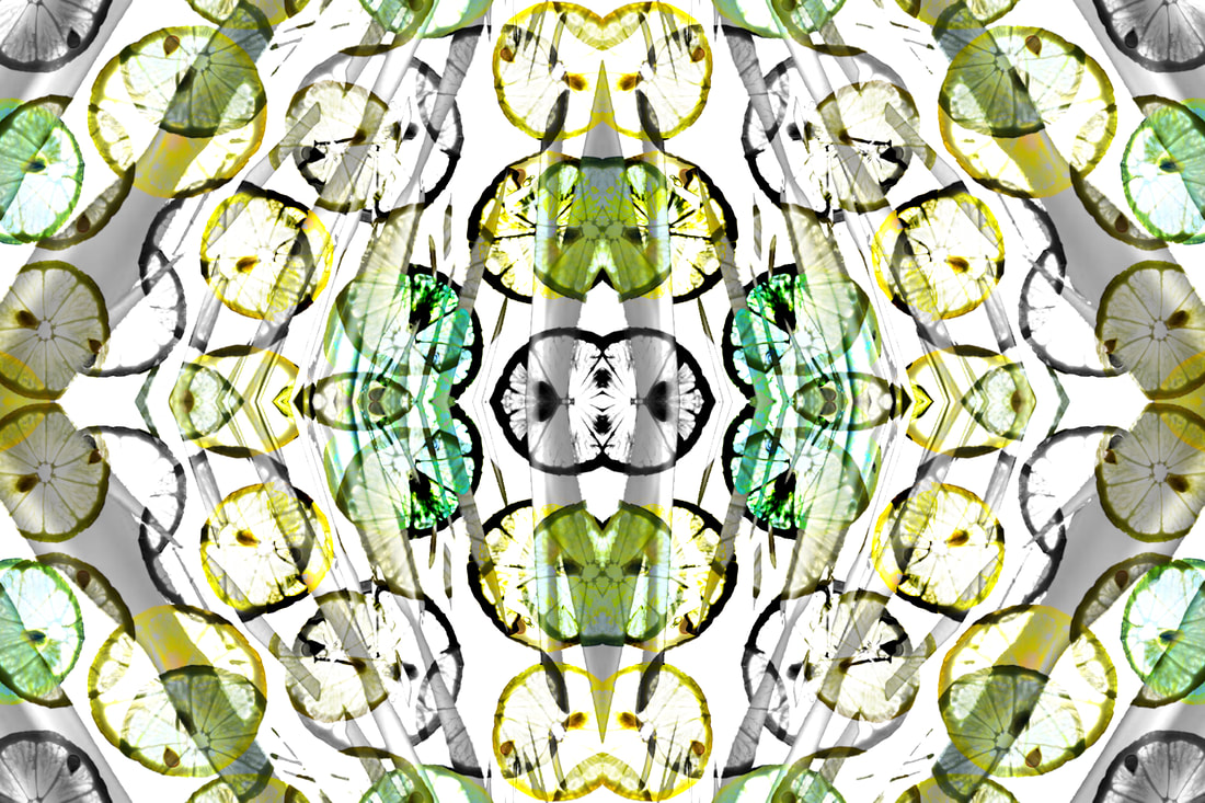
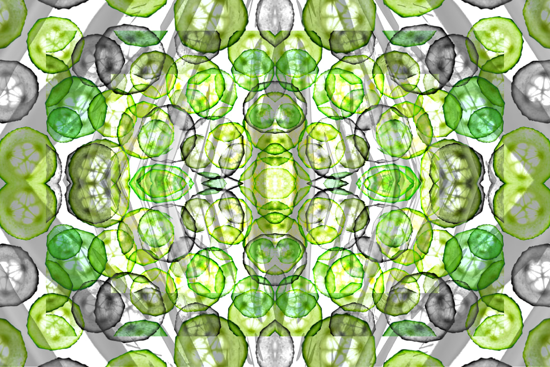
Rotational Designs / Dennis Wojtkiewicz
Using rotational imagery and the work of Horst P. Horst, I have created a series of rotational designs using the abstract elements of shape, colour, form, tone, repetition and harmony. I will develop these further using Pixlr.


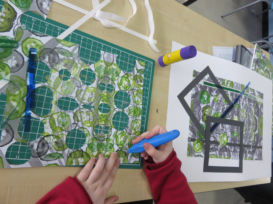
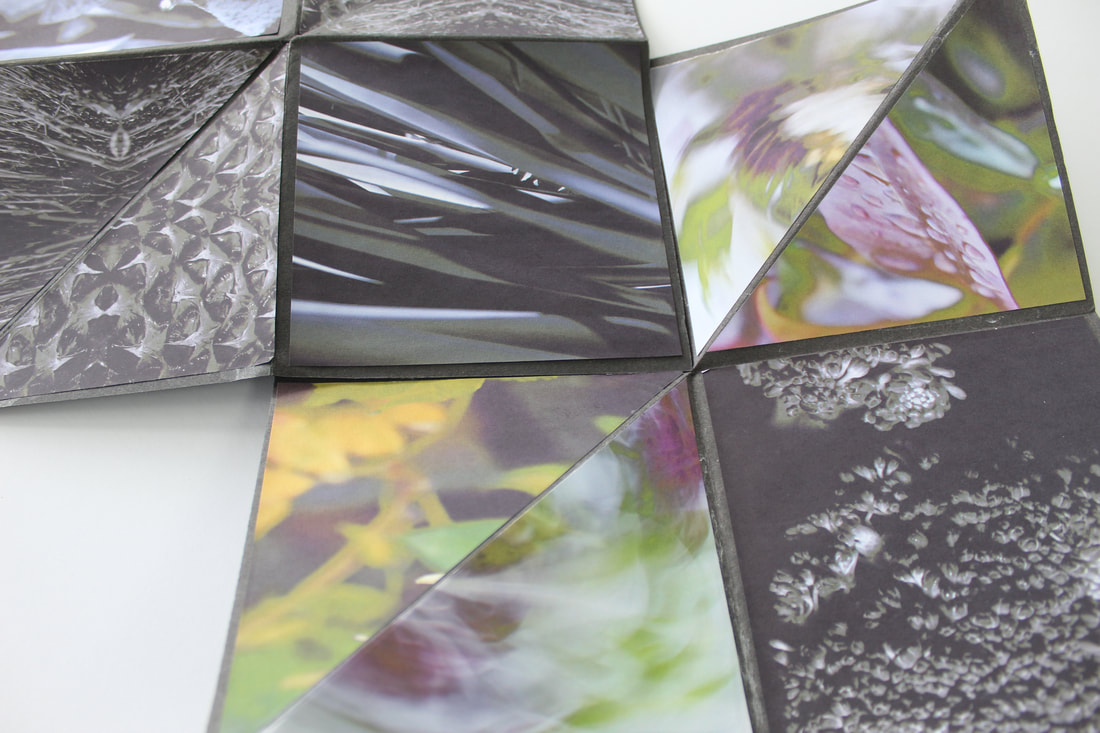
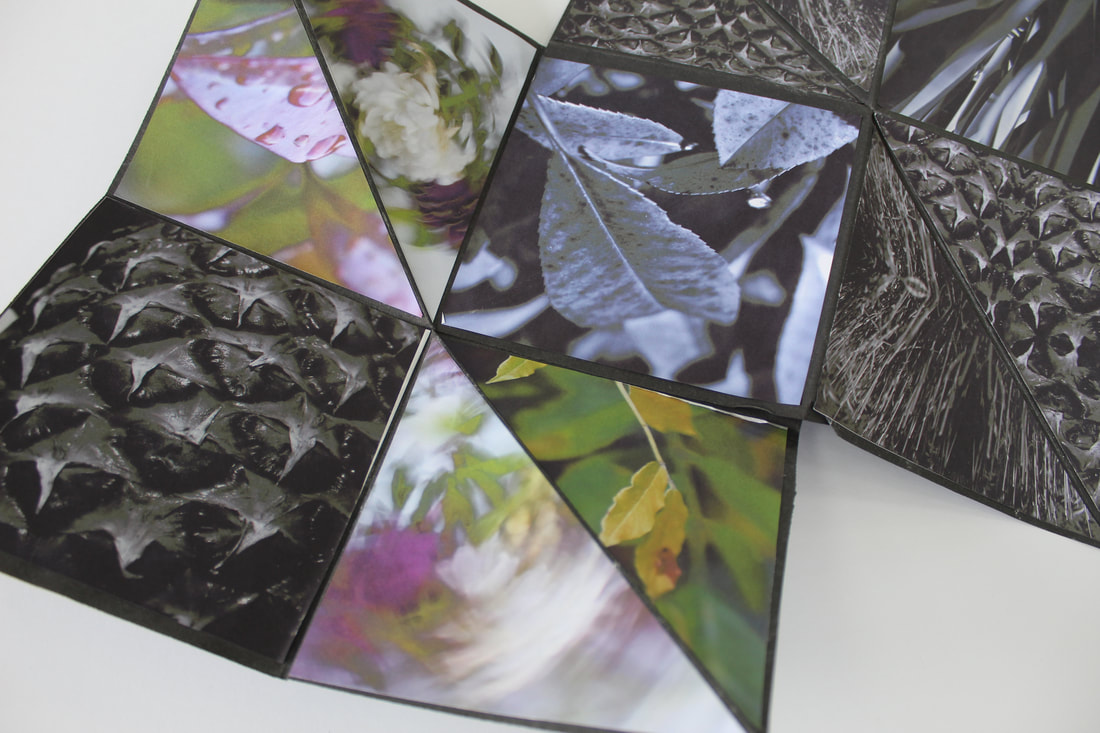
Explosion Sketchbook

|
|
Abstract Nature / Final Evaluation
Throughout this project I have developed my understanding of abstract photography by exploring the theme of nature. Previous to this project I had practically no understanding of the camera, let alone all the techniques it can be used for. Some of the key skills I have developed are : knowledge of aperture, shutter speed and ISO; the formal elements of photography; camera techniques - intentional camera movement and shallow depth of field; early forms of photography and back lighting. I have also developed my skills using editing software, creating rotational imagery inspired by Horst P. Horst.
Initially, I researched the work Javiera Estrada. The area of Javiera Estrada's work I decided to study was her aqueous motion photography and the collection 'Fluer De Sel', specifically her photo 'Oxytocin'. Aqueous motion is the technique of taking photos of flowers underwater whilst pigments float through the water. This creates a really nice technique as each image is its own individual. Not only this, but as the images are taken through water, it produces ethereal imagery as it generates the illusion of having a floating subject. Estrada's work is inspiring as it is a tough shoot to pull off. Producing a clear background and positioning the flowers where you want them is extremely tricky, and on top of that you only have a few seconds to take the photographs before the pigment completely disperses in the water. Through studying this artist, I was able to explore concepts of line, shape, colour, harmony, form and movement in my own photography examples. Inspired by her work, I created a series of emulations by picking an array of flowers from my garden and placed them in a vase of water. To weigh down the flowers and to stop them from moving, I tied them to a few coins. Next, I placed food colouring in both milk and water, however I only used the dyed milk during my shoot as I felt that was what looked most similar to the photo I was studying. Finally, I slowly poured in the dyed milk whilst taking multiple shots with my camera to capture the best moment where the milk dispersed into the water. I investigated the technical processes of how to use a camera as this was my first time using one. I feel that this greatly developed my skills as I not only learnt about ISO, shutter speed and aperture, I also learnt about the importance of lighting. Throughout this first shoot I realised how crucial good lighting actually was, as even a change in angle could cause the light to reflect off the vase and ruin the composition I was trying to achieve. Although initially I was happy with the outcome of this shoot, I now feel that I could make many changes to improve it. Firstly, I would use a wider vase to allow myself more room when photographing as well as more space to crop when post-editing. Secondly, I would choose a better composition for the flowers. Even though they all harmonised I feel that I could have chosen better colours to match the photo I was emulating as well as better colours for the dyed milk. Javiera Estrada’s work helped my understand the theme of abstract nature from her conceptual photography style. As she is photographing a subject underwater, she is able to produce an ethereal ambience as it’s unlikely you’ll ever see a mist-like substance floating around a flower in real life.
The second artist I researched was Edward Weston, being inspired by his skilful use of composition and contrast. I studied his photo (who many will argue he’s most famous for) ‘Pepper No. 30’. As I studied the concepts and techniques in Weston’s work, I was able to apply it to my own, understanding how not only line and shape, but also contrast contributes to the intense atmosphere Weston has demonstrated throughout his works. This intense atmosphere is mainly created by Weston’s use of low key photography - usually produced with a low aperture. To emulate him during my shoot, which was inspired from his work, I shot vegetables on a plain black background with the monochromatic setting on my camera. During this shoot, I could demonstrate multiple technical processes that was conveyed throughout Weston’s own work, such as the rule of thirds, studio lighting and contrasting tones. Overall, I feel that Edward Weston’s way of photography helped improve my own, as it not only helped me develop my photography skills, but also my editing skills. Although I enhanced my skills with lighting and composition, I also gained new skills with editing on Pixlr. I learnt how to change the exposure and contrast in an image and how to remove any unwanted objects throughout the photograph. These skills have greatly benefited me as I have used them throughout all my shoots where post-editing was needed.
The third artist I studied was Anna Atkins, an early photographer and botanist who, using an early form of photography, photographed a series of plants for scientific purposes. I thoroughly admire her work as she uses a form of photography which doesn’t require any type of camera. Her work links with our topic as it explores the aspect of nature, and as these types of photographs are produced from exposing chemicals with a UV light, she produced shape and line directly from the subject she wanted to photograph. To emulate her work, I placed an array of different types of leaves over light sensitive chemicals painted over a piece of water colour paper, and let it be exposed under a UV light. Once it had been exposed for long enough, I washed the chemicals off the paper to stop any further development. This was an interesting process as it was a form of photography I had never experienced before, and it took a lot of skill to produce the exact image you want.
I next looked at the work of Man Ray, an American photographer who, similarly to Anna Atkins, photographed without using a camera. I am influenced by his work as he, like Atkins, was able to generate images without a camera and instead with light sensitive paper. I feel that his work links to our project as it explores the more abstract side to it, his photograms creating pictures with tones that are opposite to the ones we see in reality. If given the opportunity, I would love to further explore this style of photography.
The fourth photographer I studied was Horst P. Horst. I am inspired by his images as they survey the abstract side we are studying throughout this project. His work employs a range of tone, line, shape and contrast, especially as there is always an area of interest in each third of the images. Evaluating his work has helped me develop my own skills as I used his technique for not only my cyanotypes, but my monochromatic photography and my final shoot for this project. Not only does Horst P. Horst’s work explore tone, line, shape and patter, it also explores the themes of pattern, symmetry, harmony and unity. This is seen through his rotational symmetry as he uses multiple of the same image in one final piece. I find this inspiring as it uses un uncommon form of editing, creating abstract pictures and causes the viewer to think outside the box about what the original image is.
The fifth photographer I explored was Karl Blossfeldt and his exceptional photographs of still life / natural forms. Blossfeldt’s work allowed me to explore a new lighting technique, one completely the opposite to Edward Weston : high key photography. Although there is not a high level of contrast with this style, there is still a high level of detail that can be achieved. Blossfeldt demonstrates a range of elements throughout his work, the main ones being line, texture and tone. He is able to demonstrate these elements through the subjects he chooses, picking interesting natural forms that aren't often used in photography, giving his work an abnormal aura and a strange feeling. To emulate his work I did a series of shoots using aerial photography, backlighting photography and backdrop photography. I placed natural objects (like flowers and pinecones) and used either a macro lens or I photographed my subjects up close to receive a similar amount of detail, as did Karl Blossfeldt. Although there were aspects of my shoots that were unsuccessful (being the camera settings and the shadows seen in my work) I feel that overall some photos came out successful as they were in a similar style to Blossfeldt. These shoots helped me further develop my editing skills as I learnt how to change the tone and hue of the image as well as how to eliminate the shadows and unwanted objects in the background,
The final artist I studied was Dennis Wojktiewicz, and I was inspired by his amazing use of colour and hues. With both my knowledge from one of my previous shoots and from his own methods (supplied by his email response) I could create an array of images inspired by him. To create my emulations, I used the technique of backlighting my subjects by thinly slicing fruits, placing them on a sheet of transparent material (for example a piece of glass) and then placing a source of light underneath the glass to show the details of the fruits throughout my images. I feel that this shoot was successful as I had an array of fruits to photograph, most of which illustrated a high amount of detail. This shoot was also a success as I had an extremely developed skill of editing and could quickly and efficiently edit my images to be ready for my exam. In my final edits I was able to emphasise the detail in my fruits as there were multiple repeated images that had different tones, colours and hues. My rotational edits were the most successful as I overlaid images from my previous monochrome natural forms shoot, producing a more abstract look throughout all my edited images. Overall Wojktiewicz's work helped my understanding of abstract nature as the macro photography he uses demonstrates a range of abstract detail, meaning the natural forms do not look like what they actually are at first glance.
Overall I feel that my most successful project is the Dennis Wojktiewicz shoot as I had used all my previous skills I learnt to demonstrate through my final project and exam. I used a good composition whilst editing because the fruits were laid out well, they were framed properly and the rule of thirds allowed for every section of the image to have an area of interest. Throughout this project I think I was able to illustrate my colour and lighting skills during both the shoot and editing process. I used my previous knowledge of back lighting (from my Karl Blossfeldt shoot) and applied it to my Dennis Wojtkiewicz shoot to enhance the finer details. When editing, I changed the exposure, hue and contrast to further enhance the detail as well as changing the colours of some fruits to vary my image, which gave my photograph a good contrast between darks and lights as well as a correct image exposure. Since my images were the result of aerial photography, an interesting viewpoint was created because the final images don’t have any context of the fruits being laid flat, producing a fascinating composition. Not only this, but my final images were not overly cluttered since the edits only contain one picture of a fruit that had been duplicated multiple times to create the illusion of there being many fruits overlaying each other. Finally, I feel that this project was well planned out. This is because I had an in-depth understanding of Wojtkiewicz’s techniques, processes and methods, and although I didn’t paint my final images like Wojtkiewicz, I still achieved the same quality of photographs like he did.
To improve on my next topic, I would like to further develop my camera skills. To do this, I will try to do multiple shoots for each project to have a wider range of images to choose from in my contact sheets as well as when I am editing my final images. Not only this but I would like to improve the quality of my photoshoots by thinking through the composition, the props and the equipment I use (such as a tripod and shutter release cable for stabilisation). I would also like to increase my creativity- not only through experimenting with different viewpoints, framing, colours and lighting, but also through my post editing - weather that be trialing new tools I haven't used before, or creating a more dynamic composition overall. Finally I’d like to further enhance my research skills - for both the artist I’m studying and the technique I’m using.

